I was recently asked to talk to a women in business group about common website mistakes. I’m in no way an expert on web design and my own website is still in transition. However there are some common mistakes that people make that are easy for even me to spot. Focussing on these could make a big difference to the way your site performs. Here’s the 10 points I came up with, do you have any to add?
1. You Don’t Know Why You’ve Got One
Lots of small businesses I encounter know they need a website but haven’t quite figured out what for. Knowing what you want to achieve from your site is the first thing you should think about. Here’s some suggestions of why you might want a site:
•So people can contact you
•So people can find out where you are
•To sell – e-commerce
•To sell – get new sales leads
•So people will find out about you
Once you’ve defined your purpose you can make sure that your site is answering it.
2. No Call To Action
What do you want people to do when they visit your website? Making it easy for them to know what to do will mean that they do it! Here’s some ideas:
•Call you? – phone number
•Join your mailing list
•Ask for more info – enquiry form
And here’s an example from Red Oak Tax Refunds, their goal is to get people started with the process of getting their tax refunds:

3. It’s Hard To Navigate
When someone arrives on your website is it easy for them to find what they want? Try and keep the navigation simple, too many options can put people off, too much choice is not always a good thing. Make sure that it’s easy to navigate the site from every page not just the home page. I love the simplicity of the design on the Oxfam website.

4. Your Images Don’t Represent Your Brand
Stock images pop up all over the web. The problem with using images you buy from a stock site is that you don’t have ownership of them. Anyone can buy the same stock image you have and use it on your site. I’m a big believer in showing the personality of your brand on your website and images are an integral part of that. If you are investing in your website it’s worth investing in some good photography too, either specific images for your site or images of yourself and your staff. When I land on the IT Force website I am already getting to know the people behind the business.

5. Your Text Is Hard To Read
We spend a long time putting together the text for our websites. Very often we get carried away with creating text that will work well for the search engines and forget about what the people who visit our sites might want. I find it easier to write the text first and then go back to see where keywords can be fitted in. This makes the text flow far better. Here’s some other tips for the text on your site:
•Use a plain easy to read font
•Make sure that your colour scheme is easy to read and doesn’t hurt the eyes
•Get it proof read- don’t trust spellcheck!
•Write in the right style for your target market – avoid jargon
•Keep it short – people get put off when they see too much text
6. Too Much Clutter
If your website is cluttered it could be very off putting for people visiting your site. Too much information can be confusing and it can cause people to leave your site without finding what they want. If you have built your site on WordPress it can be tempting to add all the great plugins that are available, but add too many and instead of enhancing your site it will work against it. Think about what information you really really need and if it’s not essential don’t include it. I love the clean look of the ‘Bumps ‘n’ Babies’ site.

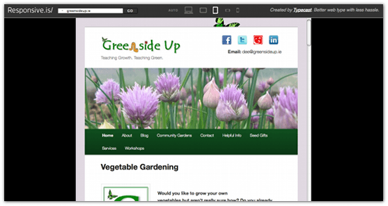
7. It’s Not Mobile Compatible
With more and more people accessing the internet via mobile devices it has become essential that our sites are mobile compatible. When someone visits your website on their phone or tablet do they have to scroll around the screen to find what they want or is your site responsive, does it adjust to a mobile screen? This weeks cool tool is a handy way to find out. The good news for those who have built their websites on WordPress is that you can add a plugin or choose one of their mobile themes. See this example from GreensideUp:
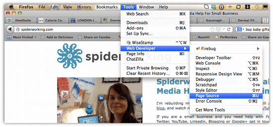
8. It’s Not Search Engine Friendly
I’m often surprised by the number of websites that don’t have basic SEO in place. I’m no expert in search engine optimisation but I do know some bits and pieces. It’s worth checking whether your website has page titles and descriptions in the meta data. To do this you need to view the source code. Here’s how to find it using the Firefox browser:

9. Your Website Is Not Up To Date
This is a mistake that I have made. I manage my own website and updating the non-blog pages sometimes ends up on the long finger. My heart used to sink every time that someone would call up and say that they had been on my website as I knew that the next thing they were going to do was to refer to my ‘Packages’. ‘Packages’ were something that I put in place when I first set up my business but were not relevant after the first six months. I hated having to explain this every time, eventually I removed them. It’s important to keep your website current, I know that it’s something I continue to struggle with but it makes life easier for you and your customers if the information is up to date.
10. No Blog Or News Section
You may have realised by now that I am a huge advocate of blogging. I do believe that if you can blog you should blog. There are huge benefits, here’s just a few:
•The more you blog the more chances you have for Google to find you for your keywords
•Blog content seems to get indexed immediately
•It establishes your expertise
•Gives content for others to share on social channels
•Quick and easy way to update your website
•Makes you look active
•It’s a way for customers to talk to you
If you need more inspiration of what not to do, check out ‘The World’s Worst Website‘ – Warning, it has autoplay music.
If you enjoyed this blog post why not subscribe to my newsletter or my blog posts via email. Click here for more info.