
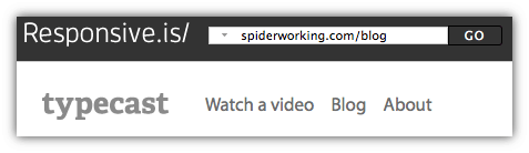
Mobile internet use is growing at a scary rate, more and more people are logging on to the internet on their phones and tablets than ever before. Because of this it’s becoming crucial that our websites are easy to view and navigate on every device. Unless you own every possible device this can be hard to gauge and that’s where this weeks cool tool comes in handy. Google’s Mobile Friendly Test will show you exactly how your website appears on different devices.
Here’s how it works:
- Visit the Google’s Mobile Friendly Test website
- Type your web address into the bar at the top and click ‘Go’
- Now from the top menu select the type of device you want to view the site on. You can choose from:
- Laptop
- Tablet in landscape view
- Tablet in portrait view
- Smartphone in landscape view
- Smartphone in portrait view

- It’s as simple as that, now you can see how your site works on each device and if necessary work on creating a website that is easy to view and navigate on all of them.
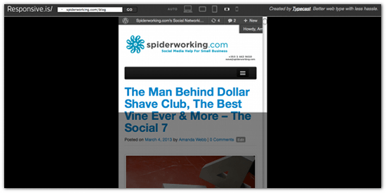
As well as showing you what your site looks like it also shows you how much of it appears above the fold by greying out the section that appears below it.
It’s at times like this that I am delighted that I have chosen to redevelop my website on WordPress, the theme I have chosen is responsive and does work well on all formats. It’s not perfect however, the navigation needs some work and I’ll always be looking for ways to make it better.
How did your website fare on Responsive.is?
A massive Hat Tip to MadDog Digital for showing me this tool, they also develop responsive websites so give them a shout if you need some help with yours.


